Powers
Service
Graphic Design
Category
Television
Year
2013-2014

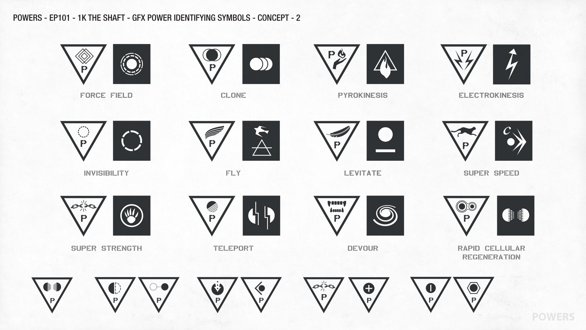
Powers gave me the opportunity to contribute graphic concepts for the pilot episode while freelancing with the art department. One of my favorite assignments was designing a series of symbols that represented different superhuman abilities. It was a chance to explore how simple forms could communicate complex ideas.


the challenge
Each symbol needed to be clear, distinctive, and immediately recognizable. The goal was to create a visual language that felt consistent across the series while giving every ability its own unique identity. It was an exercise in reducing an idea to its most essential elements.
Designing the icons was one of those projects that reminded me why I enjoy graphic design. It combined problem solving with experimentation, encouraging me to explore how shape, balance, and symbolism can communicate without relying on words.

conclusion
Looking back, Powers reinforced my appreciation for simple design. The strongest ideas are often the ones that say the most with the least. That approach continues to influence the way I think about identity systems, illustration, and visual communication today.